I viewed a lot of portfolios when I was hiring artists – and I ignored most of them. So how can you avoid the mistakes other artists make?
That’s all the chance an artist has – less than a second.
Your website can absolutely hurt your chances of being hired. Before I made games, I worked as a professional web designer. I definitely pay close attention to an artist’s website.
Here’s what made me ignore portfolio sites, without even looking:
When I was looking to hire artists, if I saw an ugly site, I usually just closed the window. That’s it. That’s all the chance that artist had – less than a second. If the site took a little too long to load, if I had to wait for a stupid Flash-image-carousel, if the artist wanted me to watch video turntables instead of showing me high-res images upfront – I closed the site. I can hear you now:
Maybe you’re just a big snob, James! Other art directors won’t care!
Yes I am a big snob. BUT! Other art directors will care. Even if they don’t know web design, the same rules apply. Why? Because a good artist makes good art. Regardless of medium. If you have an ugly website, the art director can conclude that you don’t have a sharp eye when it comes to aesthetics. He’ll wonder, what else will you be bad at? Close site, next candidate!
Quick portfolio site tips
Here are three quick portfolio site tips: You need to build a website that is appealing, gets to the point, and loads quickly.
1. Appeal
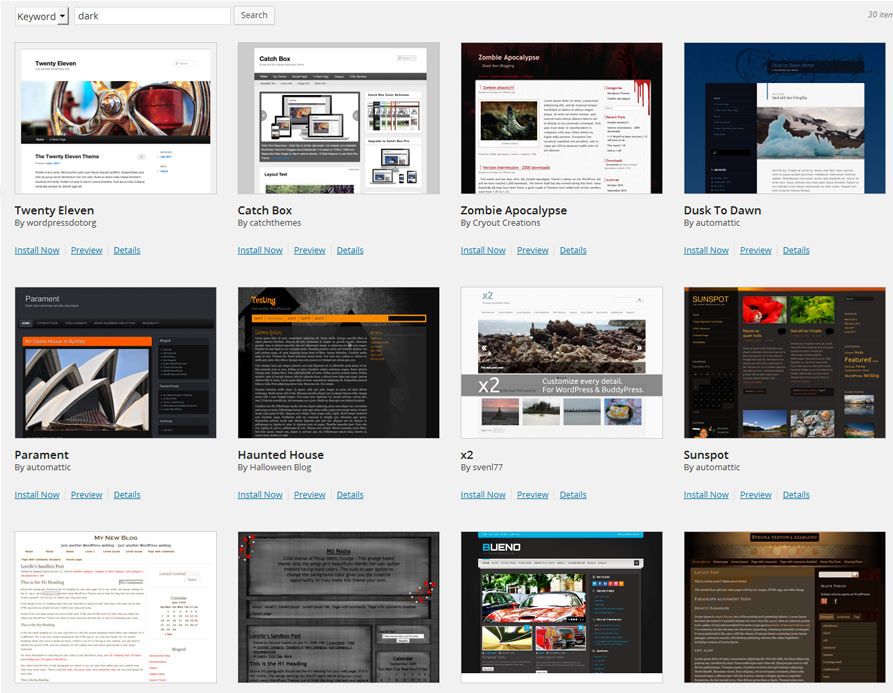
I’m assuming you’re no web designer. That’s no obstacle. There are plenty of professional web designers creating great templates all over the internet that can make your site look good, so use those templates! One quick suggestions: WordPress is easy to install and implement, and there are a ton of free themes to use. Try using a theme that is targeted at photographers, those themes are usually focused on presenting images without much text to distract you.

2. Get to the point
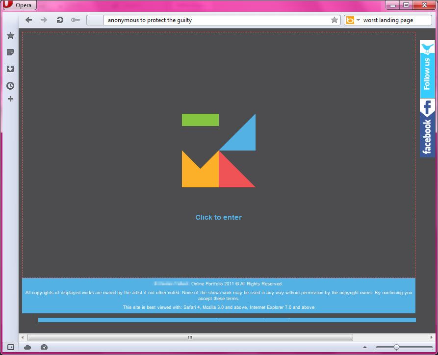
No landing pages! What is this, 1997? When someone lands on your site, they should be seeing your art, right away. No ‘click here to enter’, no ‘splash pages’.

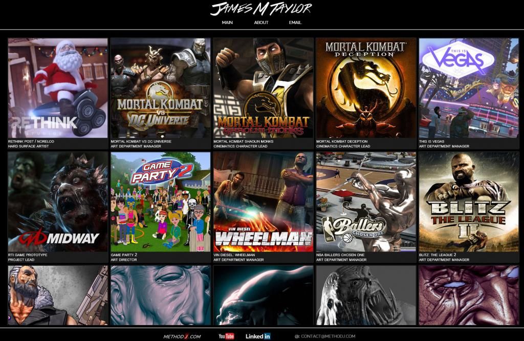
Your goal is to start showing your art, right away. Look at my portfolio site. See how tons of thumbnails and images are presented right off the bat. It gets to the point. 
3. Loads Quickly
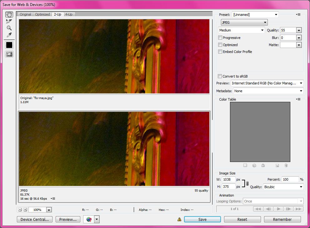
Google prioritizes sites based on how quickly a site responds. In fact, Google provides a tool to test the load times of your pages – use it! Your images are probably the elements of your site that load most slowly – so optimize them. CTRL + SHIFT + ALT + S in Photoshop brings up the ‘Save for Web’ dialog. Use it to optimize your images.

Go forth and register,
or not, you don’t necessarily need your own domain name. Here’s a good plan to get started:
- Make a free account on wordpress.com, or blogspot, or anywhere that gives free hosting.
- Optimize your images and get your art up online.
- Make sure your site is easy to use. Have strangers test it and watch how they try to use it.
- Get people to look at it. If you want feedback, post a comment with a link to your site.
- Then start applying for jobs!
Also: check out my article on an easy way to create better looking renders for your portfolio.

Great tips James!
Good advises. Short and straight to the point. Will greatly appreciate if you can give me a feedback on my website portfolio. http://albertdanilov.portfoliobox.net/
Thanks for the great advice James. Do you mind taking a like a my portfolio. Thank you!
http://wonderdesignz.com
Hi James,
I discovered your website yesterday and find your articles super helpful and motivating!
As for online portfolios – you suggest WordPress or Blogspot – how well received are Tumblr blogs in the industry? Even if it’s just for showcasing your art, I can imagine it does have a little negative reputation. Just want to make sure to pick the right hosting service before I revamp my portfolio. Thanks!
Best regards,
Dana
Thanks Dana, glad to hear my site is helpful!
For portfolio, the easiest thing now is to just make an artstation page. Straight and to the point!