I hate those ads. But in all seriousness, this is a really easy way to improve your portfolio!
So, what are employers looking for in a portfolio?
Reader Chris asked a great question, about what employers expect to see when reviewing a portfolio. I reviewed a lot of portfolios when hiring artists, so I’ll get to that in a minute. Suffice to say, most artists are blowing a huge opportunity with their portfolio images!
But first – he also asked how I created the look for my Butler renders. I’ll tackle that now, then talk about portfolio renders.
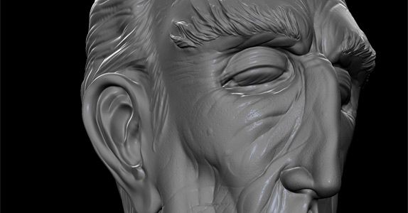
Step 1 – the base render
I start with a screengrab from Mudbox. I don’t remember my shader or lighting settings, but I’m almost certain that I used default lighting and a shiny grey shader for a bit of specularity.
Step 2 – add a background
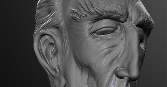
In Photoshop, I add a light gradient in the background to add some interest. The key lighting in the image looks like it might be coming from the right side of the frame, so that’s where I chose to add the gradient.
Step 3 – adjustment layers (this is the 1 easy trick)
The trick is, there’s nothing to the actual render. It’s basically just a screengrab!
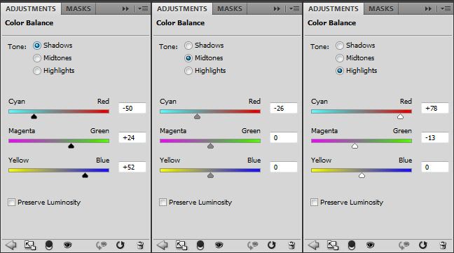
The magic comes from Photoshop’s Adjustment Layers. In this case, I used a Color Balance layer.

Adjustment Layers
If you look at the image, you’ll see that the shadows of the image are tinted towards blue, and the highlights towards red. This is what makes the image look more interesting.
This is a photography technique called split-toning, and it’s original use was to add a bit of color to black and white photographs.
Below, you can see the settings I used for the Color Balance. There are separate settings for the Shadows, Midtones, and Highlights of the image.
Combining Adjustment Layers
Adjustment Layers can be stacked on top of each other. They have layer masks to customize where the effect is applied. And we can control the layer opacity, just like any Photoshop layer.
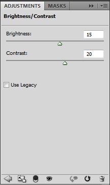
The last step is adding a little punch on top. We adjust the contrast of the image with a Brightness/Contrast Adjustment Layer.

Below are the contrast settings.
Now, let’s improve your portfolio!
My Butler renders might not be exactly what every employer is looking for, stylistically. But, the renders do represent the kind of thinking that will absolutely help improve your portfolio.
Most artists make a huge mistake when thinking about what goes into their portfolio. They think about the art they’ve created as their portfolio – a collection of 3D models, sculpts, textures, etc.
And they completely overlook the portfolio itself!
Consider the images above. Does my finished product do a better job of describing the sculpt? Not really. The basic grey-shaded render does that job just fine.
But the final product does look nicer. If an artist takes the time to polish every image on their site, their whole portfolio will look that much better.
Looks matter.
Of course they do. This is a visual medium!
But a great artist makes great art no matter what the medium. Every aspect of your portfolio – every camera angle, every light, every shadow, every texture – needs to show you’re a great artist. I think I’ve shown that it doesn’t take that much extra effort to improve your portfolio.
And polishing the portfolio itself – polishing your rendered images in post, is one way of showing that extra level of attention. It shows that you have a strong sense of aesthetic sensibility.
And in today’s competitive employment market, that could be just the advantage you need!

Thank you so much for sharing your experience and all the valuable info!