Comic book lines
Note that I didn’t quite outline shapes, I never went that literal with it. You can also see lots of cross-hatching showing up, usually in shadowed areas.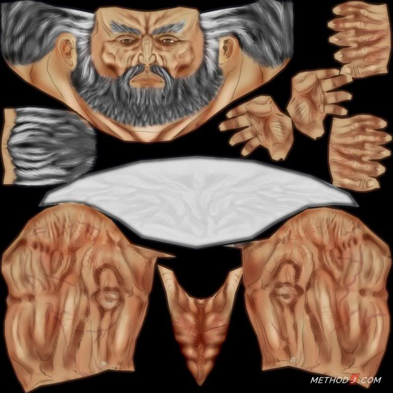
It was going in the right direction. So I strengthened the effect by overlaying the lines on top of each other in Photoshop, again and again, to create a strong black feel.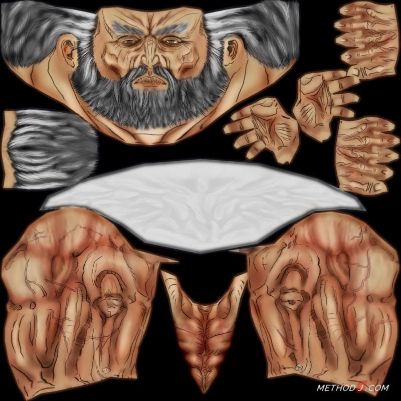
Line weight
Let’s talk about lines for a moment. Line weight and gesture is very important to this art style. Below we see three different line weights, 2 wrong and 1 right.
The first line is too straight – created using the line tool, it lacks the organic feel that Borderlands calls for.
The second is hand drawn and is more organic, but the ends are too blunt and clumsy looking.
The last line is hand drawn, organic, with tapered end. Creating tapered lines is easiest using a pressure sensitive brush and a stylus.
The same effect can be created by erasing away some of the line to manually create the taper. This taper is especially important on finer lines, like the cross-hatching. 
Back to the pants.
Taking what I learned from painting the arms, I returned to the pants. For my first pass, I tried to just freehand a bunch of lines, hoping to create a good rhythm that would feel like wrinkles.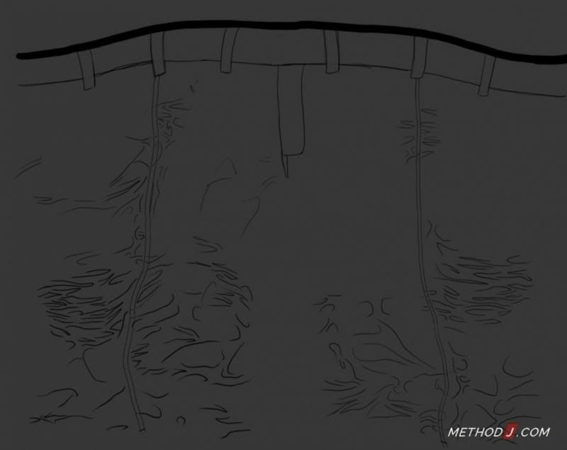
Next was the cross-hatching. Following comic-book art again, I used cross-hatch to create shadow under wrinkles.
Note the difference in line weight – the main ‘structural’ lines are thicker and heavier. The cross-hatch lines are thinner and lighter.
Definitely do structural lines and cross-hatch lines on separate layers!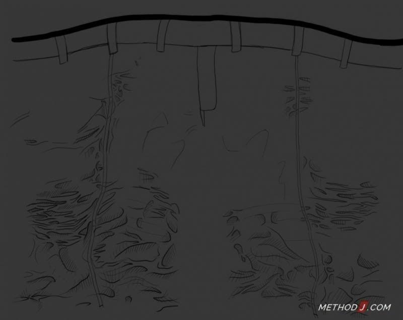
Then I added some shadow and highlight overlay layers. I wasn’t happy with the result though – the shapes were looking too made up.
Here is one area where having an existing sculpt would be a big advantage. Following 3D shapes would make the drawing process easier.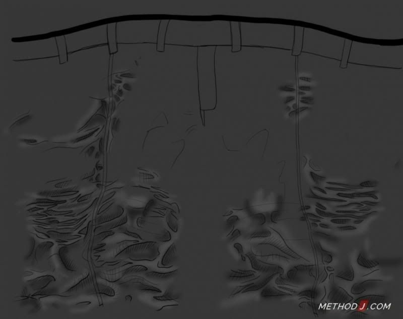
However, I wanted to focus on texture creation, not sculpt detail. So I turned to something just as good, photo reference!
I loaded up that original photoref of the leather pants, and used a Highpass filter to flatten it out a bit. I would use this as a guide for creating lines on the pants.
I mostly followed around the edges of wrinkles. This is what it looked like after a first pass. Doesn’t make a lot of sense yet, but the underlying photo texture gives it some structural integrity.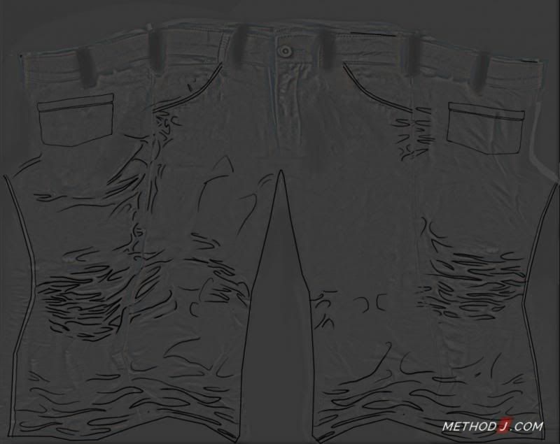
Almost done!

He is totally wearing your shoes 🙂
Could you do a tutorial on modeling the character?
Hi Oscar! I will try to post something related to character modeling soon.
Cool!
Cool!Can’t wait
Man, that was really nice, thanks for sharing this process with us.
Glad you liked it, Renan!
Hey I’m trying to make a game and I like the way borderlands textures have that black border I’m trying to make a gravel ground and need an overlay texture like the watercolor splash look like you have up but I need it to texture any ideas on where I could find art online like that that can tile so that the overlay doesn’t make it look like it’s noticeable if that makes sense
Do an image search for watercolors. As for making it tileable, you will probably have to do that yourself, finding a texture like that, that also tiles, is a tall order.
So, if you were going to do this for a whole game, what would be a good workflow if you want to be efficient(and would you leave it to a shader in the game engine to do the cel shading outline?)
I think training artists to work in this style would be the most important (and time consuming part). I don’t think there is a way to ‘automate’ it, so to speak.
And a shared is definitely the way think go! I only did it this way because it is quick and easy.
Wow James your tutorials are amazing!!!
Thanks for sharing <3B